
What are Design Systems?
InVision’s Design Systems Handbook defines a design system as “a collection of reusable components, guided by clear standards, that can be assembled to build any number of applications.”
Although this definition sounds clear and simple, it is still easy to confuse a design system with a pattern library or a style guide. So, what are the differences?
- A pattern library, in a literal sense, is a collection (or a library) of design patterns and user interface components that are used to build an application or a website.
- A style guide refers to documentations that define the basics in a design system — such as brand language, or examples of use for different interfaces and content elements.
- A design system is a combination of these two, but it also goes further by including design guidelines and principles to support better user experience, facilitate healthy design system development, and organizational acceptance.
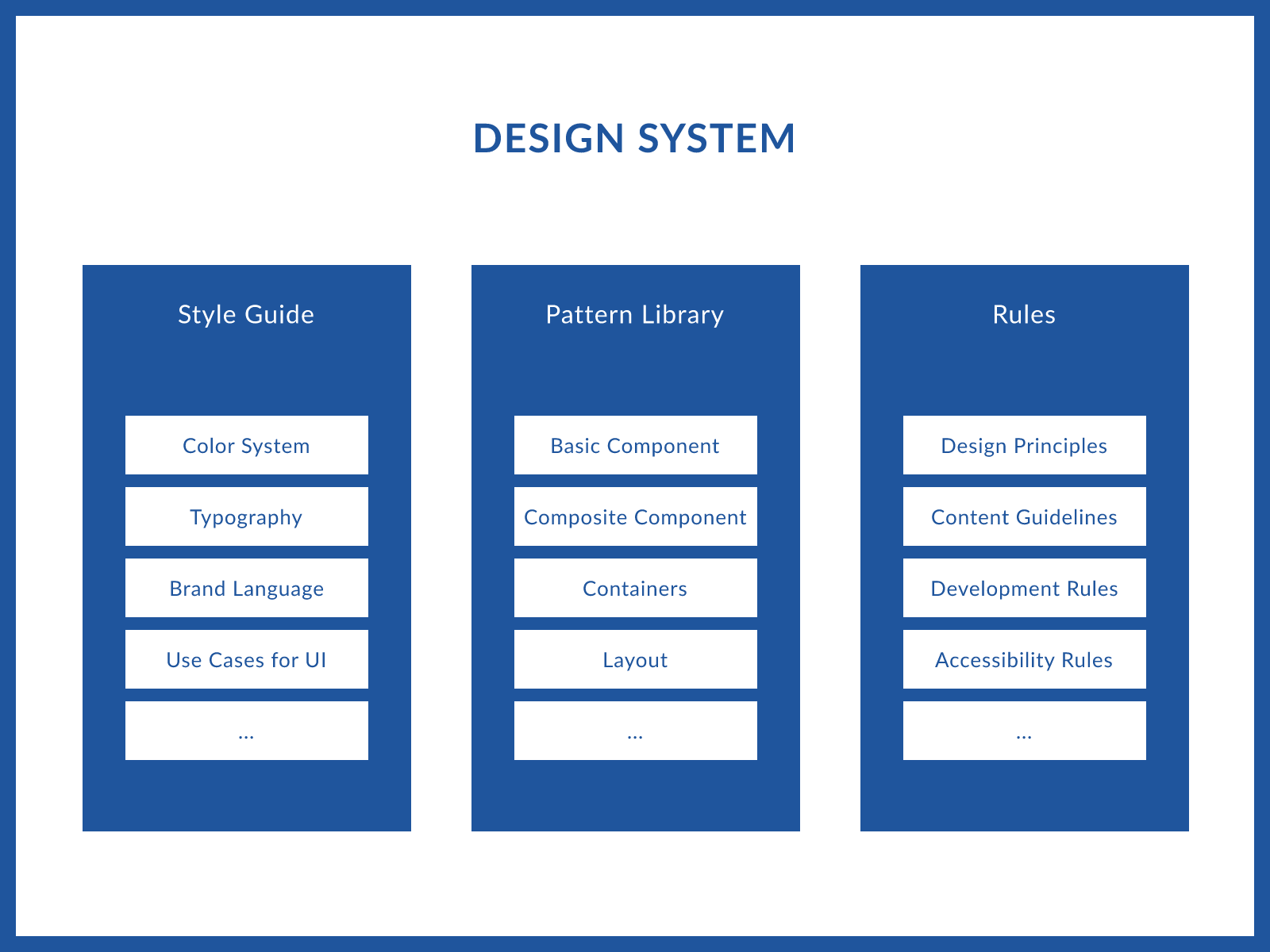
Style guides, pattern libraries, and design rules are all part of the design system.
Examples of Design Systems
- Carbon Design System (IBM)
- Material Design (Google)
- Lightning Design System (Salesforce)
- United States Web Design System (United States)
- Gov.uk Design System (United Kingdom)
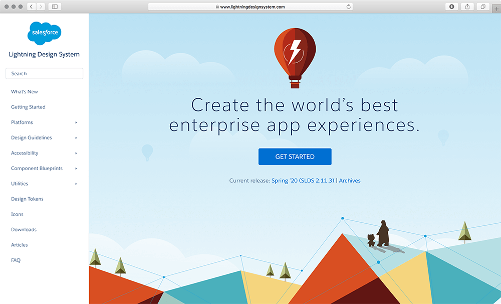
Salesforce’s Lightning Design System has a clearly structured menu consisting of design guidelines, accessibility guidelines, component library, utilities, etc.
Examples of Style Guides
- California Community Colleges Chancellor’s Office
- SAP Fiori Design Guidelines
- Dropbox Branding Guidelines
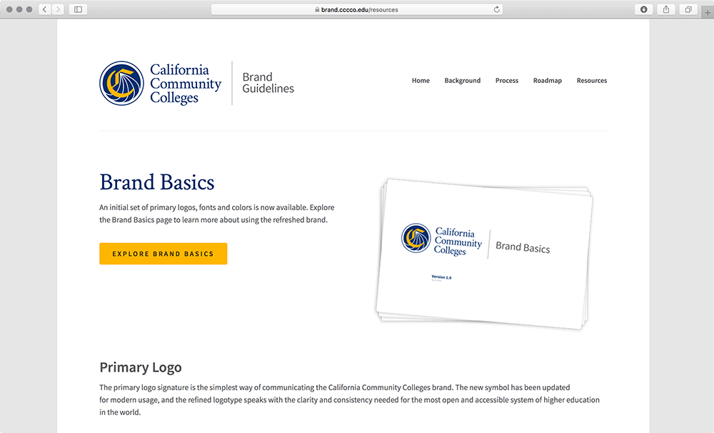
The style guide of California Community Colleges website documents guidelines and rules of the brand basics, such as color, logo, typography, etc.
Examples of Pattern Libraries
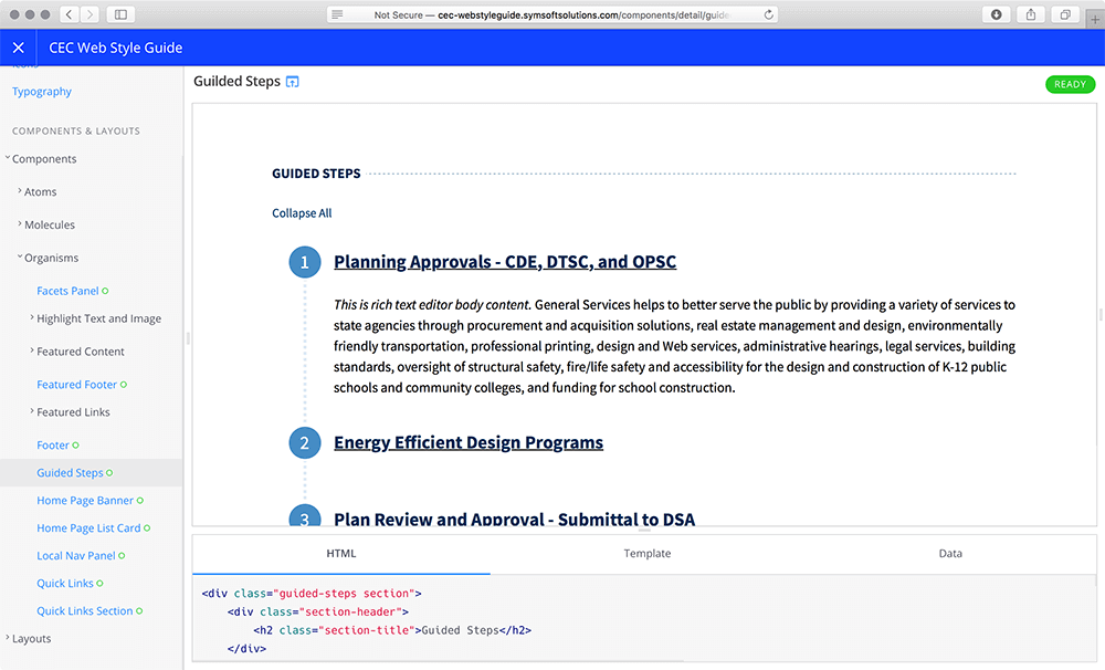
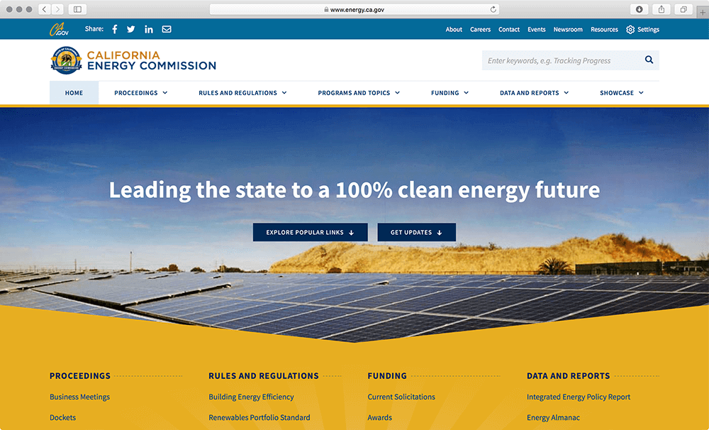
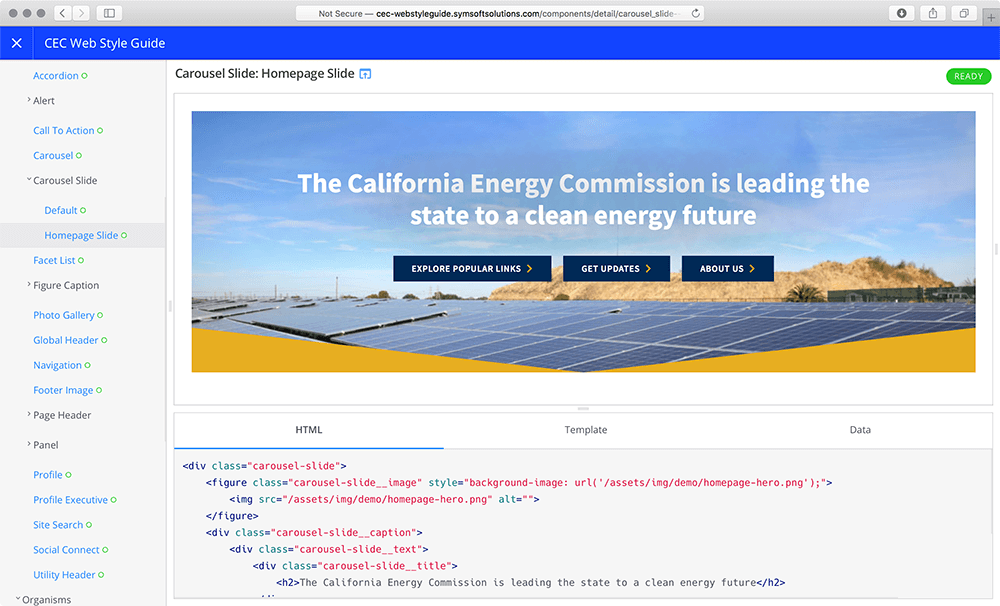
California Energy Commission’s pattern library documents the user interface patterns and components as well as the development code to be used on their website. For the purpose of creating pattern libraries for our recent projects, SymSoft’s front-end engineers used Fractal, an open-source library for building and documenting interface components.
Benefits of Design Systems
Last year our design team was collaborating with the CalPERS User Experience Team to build a design system for the Web, based on the existing brand guidelines and organizational objectives. By integrating brand language with design assets as well as design principles and guidelines, the CalPERS design system provided the in-house team with a sustainable model to build products such as myCalPERS, as well as to communicate with other product teams.

A good design system can bring extensive benefits to organizations, including:
- Brand recognition — A good design system communicates a company’s value. Building a design system is beneficial for strengthening brand recognition and conveying the brand’s core values.
- Improved communication and collaboration — Well-defined design principles and clearly documented standards can help different disciplines understand why and how to use the components and assets. In this case, design systems can enhance communication and collaboration across disciplines, such as designers, developers, marketing specialists, and executives.
- Increased speed and productivity — Design systems can increase speed and work productivity. Since the user interface is broken down into smaller reusable components, design and development teams don’t have to reinvent the wheel, especially if the elements are already tested and validated.
- Space to focus on solving user needs — As the process of building a product becomes faster and more efficient, designers save more time to invest in understanding and solving user needs, as well as exploring more possibilities in the product.
- Better user experience — By utilizing a common design language provided by the design system, the product team is more likely to create a better user experience through the use of consistent and proven patterns.
As you can see, there are true benefits of using a design system because it can enhance brand recognition, team communication, and work efficiency, as well as achieve better time allocation and user experience. In the next section, we will explain the process of actually building a design system.
Building a Design System
There are six main steps for creating and maintaining a design system, including purpose identification, system audit, asset creation, visual language establishment, rationale documentation, and future improvement. These are not definitive, and by all means not set in stone, but based on our experience work quite well as a general framework for creating successful and usable design systems.
Step 1: Identify your needs
Just like in any other project that solves a problem, identify the needs and purposes of the design system. Who will use it? How often? Does it make sense to them? What are the expectations?
We like how Yesenia Perez-Cruz, author of “Expressive Design Systems,” starts her design system projects by talking to the people who are involved or will be actually using the system. For example, she would focus on talking to program and product managers, or designers and developers. From that, she defines a purpose statement — whether it states what kind of design system is needed, or if a design system is not the right answer for the organization’s needs, which in some cases, is true.
If there is a need for a design system, we want it to communicate brand values. Part of identifying needs, is, coming up with design rules and principles, which are the foundation for any well-built design system.
Alla Kholmatova’s book “Design Systems,” outlines four steps for defining design principles:
- Start with the larger goal of the product and try to match the principles to that goal
- Gather a team to come up with shared values
- Be clear about who the audience is
- Constantly test and improve design principles
Once the needs are clearly defined, proceed to the next step, the system audit.
(Sometimes, all you need to define the needs is a simple list of design principles. And even if the design system already exists, it might not be clearly or completely articulated. This is perfectly fine too. In such cases, we can take a step back and realize that the organization primarily needs a flexible pattern library that will provide brand and user experience consistency across digital properties. In any case, use the above guidelines to better understand the gap between where you at right now and where you want to be.)
Step 2: Audit the system
Conduct a design audit by reviewing current designs and taking an inventory of design assets being used throughout the product line.
A good way to perform a thorough audit is to collect screenshots of current design elements, and then categorize these elements and document them into one place, whether it’s a spreadsheet or a design tool file. A choice of a design tool really doesn’t matter much at this point (but if you want to see what we like about some of the popular design tools, read our article Digital Product Design Tools We Love).
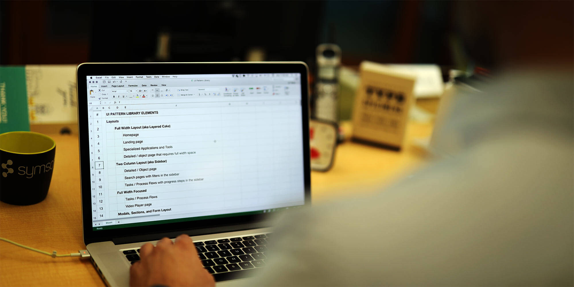
After creating the current design inventory, make a plan for creating the user interface library, also known as a pattern library, which is the core of the design system.
Step 3: Create a component library
One way to start creating the component library is by breaking down the work into different layers.
There is a general rule of component hierarchy to follow, which is also mentioned by Yesenia Perez-Cruz. She suggests dividing items into basic components, composite components, containers (or regions), and layout (or template), very similar to the Atomic Design methodology invented by Brad Frost.
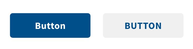
Start by documenting the basics, which are the “smallest possible elements that can’t be broken down any further,” such as buttons and links. If you are familiar with Atomic Design, this would correspond to atoms. An example of an atom is a button, a form field, or a headline.
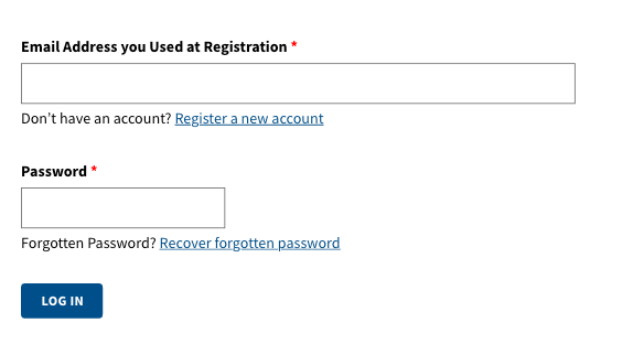
The composite components (or molecules in Atomic Design language) are a combination of basic components (or atoms), adapted to more specific use cases. If a button and a form field are basic components, a composite would be a web form.
Containers (also known as regions, or organisms in Atomic Design language) are simply areas that contain several composite components, whereas layouts (or templates) refer to how all the elements on a page are arranged. These two big picture layers are helpful for demonstrating how the content should be laid out on the page.
One common example is creating a featured content component that can host sub-components such as an image, video, map embed, or a list of items.
As you can imagine, the biggest challenge is providing flexibility, so that the team that uses these components has enough options to customize their layouts, presentation, and communication. Our own approach is to create (jargon alert!) context agnostic components that are compatible with any other component, or in many cases can be dropped into other components. (Context agnostic components work and look well next to any other component, or position on the interface. Think of different LEGO bricks that can be attached to one another to form any number of shapes, because their connectors, the little bumps, and holes, are mutually compatible.)
Step 4: Establish a visual identity
Every organization has its unique style and brand identity, so it’s important to establish a visual identity in order to strengthen the brand name and communicate values.
Erik Spiekermann, a famous type designer and author of many world-known brands, stated that a typeface plus a color is everything you need to establish a brand identity. Many other brand experts add a space into the mix. If these basic building blocks are carried over through the components, we can achieve visual consistency and brand recognition.
Example: New York Times vs Cereal
For example, with different density and weight in layout, as well as other visual choices for the building blocks, The New York Times and Cereal convey two completely different look-and-feel.
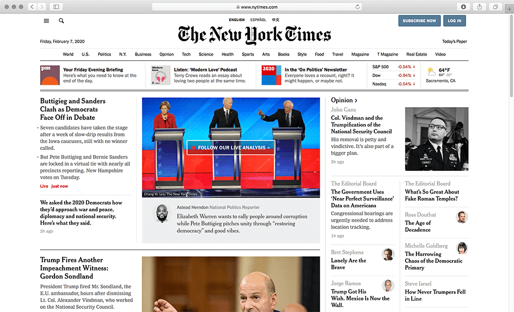
With relatively tight spacing and more serious type choices, the New York Times establishes its news site identity.
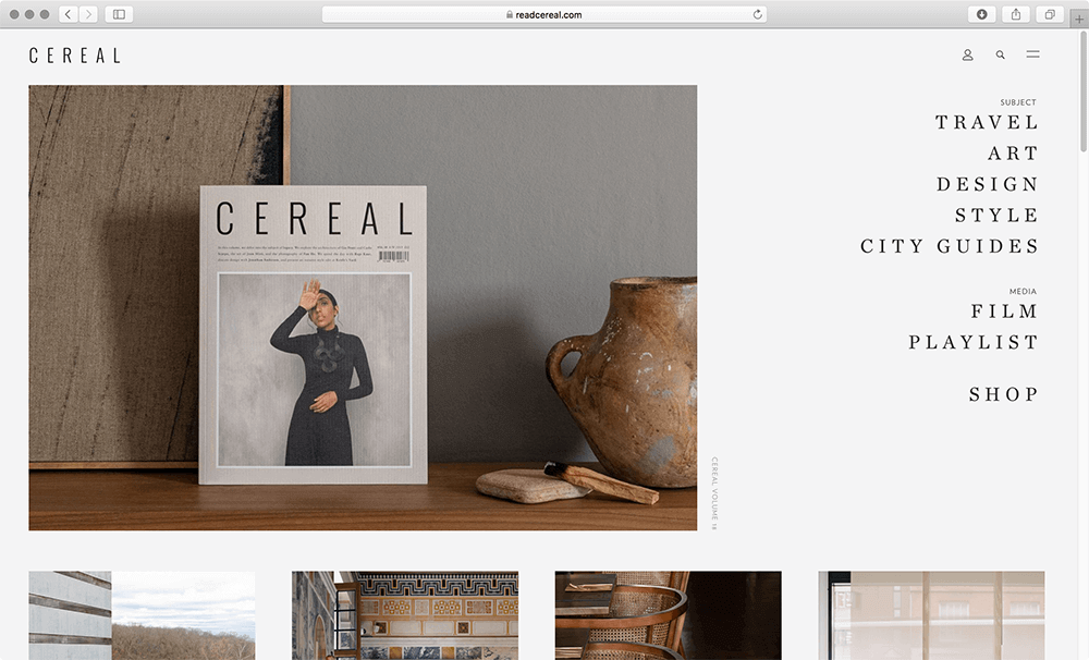
Cereal has wider spacing and more artsy choices of color and typography, which conveys its identity as a travel and style magazine.
We can start establishing visual language across the interface to make our brand more recognizable by finding traits that best represent our brand identity. By fragmenting existing brand assets into basic elements — such as typography, shape, color, texture, and aspect ratios — we can identify which parts of that visual DNA can be replicated in the interface components.
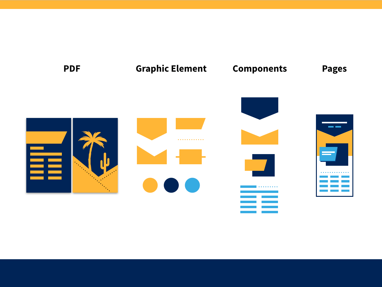
Here is an example of how our design team took traits of print collaterals from the California Energy Commission and brought them to life through interface designs. We first identified distinctive graphic design elements, such as the pastel colors, diagonal shapes, dashed lines, as well as bold typography, and then created components that would work well in a digital interface context.
Example: California Energy Commission
Triangles and sun rays were elements found in many Energy Commission publications and high-profile reports…
The previous screenshot might make you think that the diagonal shapes are part of the component that follows, but, in fact, the shape belongs to the hero slider component.
Example: Sacramento Municipal Utility District (SMUD)
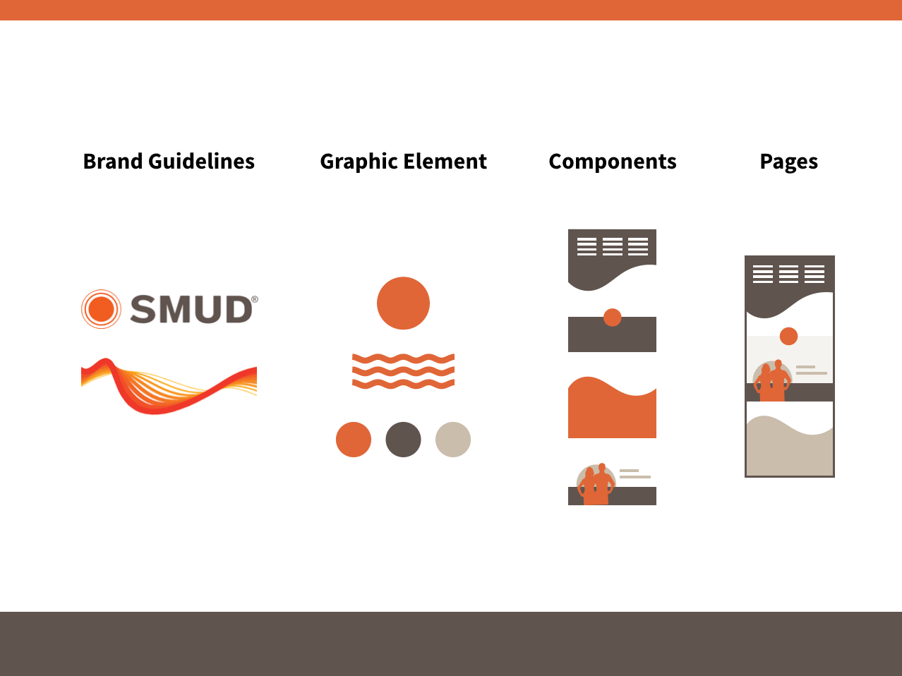
Here is another example of how our design team broke up SMUD’s brand guidelines into graphic elements and transformed them into web page designs. Key elements included the color palette, the orange circle from the logo and iconography, and the SMUD wave that was incorporated into the website dropdown menu and the footer.
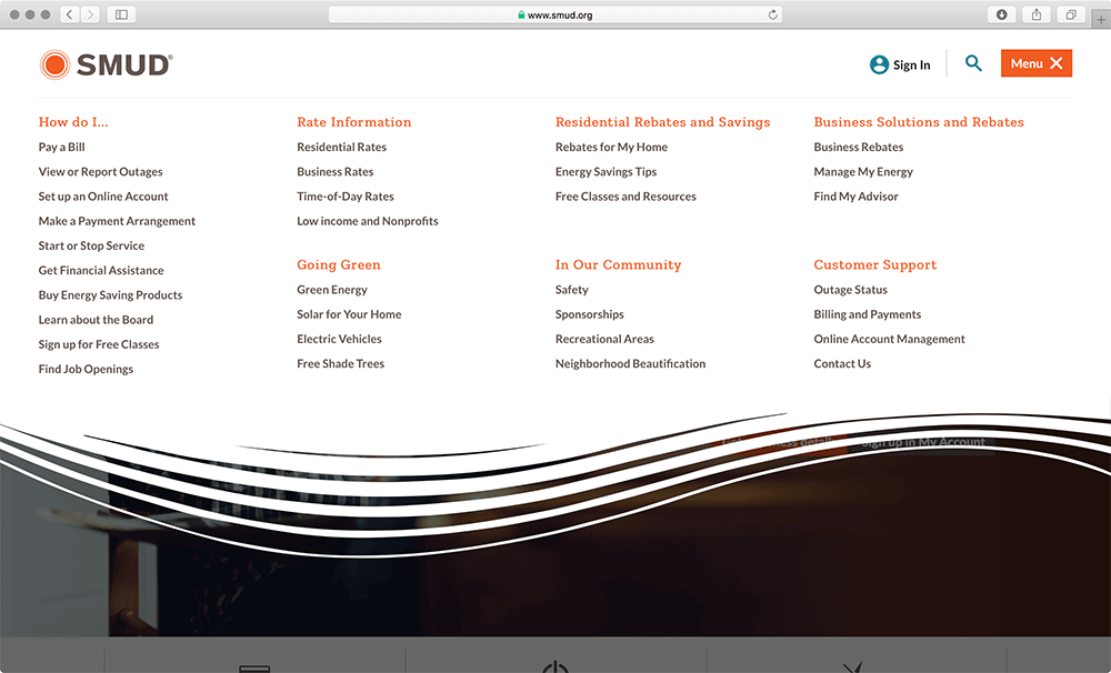
SMUD website features a branded mega menu…
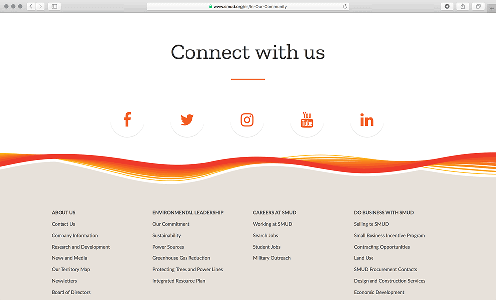
… as well as a branded website footer.
Step 5: Propagate shared language
When different disciplines work on the same product, they need to share the same language about how the design system works. Clear documentation of the “why” and “how” behind each component is essential. Skipping this step might cause misunderstandings within the team, and people might not even embrace the design system because they don’t fully understand it and don’t know how to use it properly.

Basically, shared guidelines for design, usability, accessibility, and development for the system, result in coherent user experience. Again, Alla Kholmatova suggests a useful checklist on communicating a shared design language within the team:
- Setting up a pattern wall to showcase the design system
- Referring to the name of the pattern in daily conversations
- Introducing the design system to new employees,
- Organizing regular design system catch-ups
- Encouraging collaboration
- Keeping a glossary of the used terms
Step 6: Evolve your design system
Completing the first version of your design system doesn’t mean we’re done with the work. Design systems are constantly evolving, as we keep iterating and improving our products. In this case, maintaining, as well as improving the system is another important mission for the team. A good way to improve our design system is to conduct testing sessions on real products to see how it performs.
Challenges with Design Systems
Design systems can be beneficial for a company if it’s robust and well-established. However, there are challenges we need to face or traps we need to be aware of, before having a good design system.
- Different opinions and scope discrepancy — When starting to create a design system, we need to build a multi-disciplinary team and have all the key staff on board. In this process, we might confront different opinions and discrepancies regarding the scope, depth or other aspects of the design system. In this case, it’s important to conduct thorough research on users and products and analyze the organization’s current situation, so that we can come up with the most appropriate plan and back up our plan with data and facts.
- Too rigid or overly complicated — While building the design system, we might encounter the challenge of how to build it so that it could actually be used and inspire more improvements. If we build a design system that’s not flexible enough, it would be more likely to inhibit creativity. Or if our design system turns out to be overly complicated, people might not even use it. So we need to create flexible components and be clear and precise when setting our rules and standards.
- Missing communication on the latest updates — Another challenge we might face when building the design system is how to keep everyone on the same page. Since creating a design system is not a one-man effort and we do want people to be involved, it could be hard to keep all the related disciplines updated. In this case, communication is very important. We should try to make the whole process more transparent; for example, we can keep a spreadsheet documenting the progress of each component, so that people would know which components are done whereas others are in progress.
- Maintenance — After we finish building the design system, we still have to think about how we maintain and evolve the system because the design system should be changing over time with our products. Yesenia Perez-Cruz, in her book, “Expressive Design Systems,” mentioned three ways to manage design systems. First, we can rotate people who maintain the design system so that we always have fresh minds on which part of the system could be improved. The second way is to enable the product team to give feedback on the current design system because they are the ones that are most familiar with users and products. Lastly, we can encourage contributions from everyone. For example, IBM’s Carbon Design System has this approach of having a “How to Contribute” section, allowing people to make contributions to the design system.
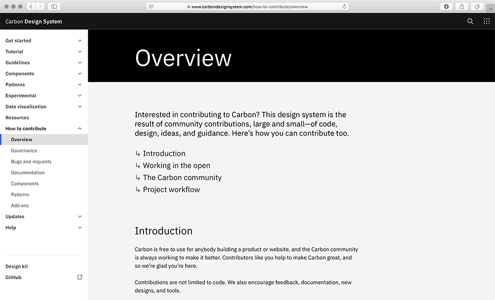
Carbon Design System’s “How to Contribute” section with guidelines on how to participate in the maintenance and evolution of a design system.
Conclusion
When we work with clients who don’t have an existing design system, getting started on a new project means a dedicated time to align with different teams that have stakes or full ownership of the design specifications, HTML & CSS code, accessibility compliance, etc. For large organizations we work with, the time can add up significantly.
Thus, a good design system not only benefits designers but also does good to other disciplines of the organization. Development teams and design teams can share the same language, which enables better communication and decision-making, while project managers are more aware of the design choices we made, which bridges the technical knowledge gap and enables better justifications.
Now that the design system provides organizations a better way of optimizing the product design process, we might wonder where the future of design could go.
Design systems provide designers more freedom and time to create and explore. How can we make design systems more flexible? How can we make the innovation process more streamlined? Can we combine design systems with AI technology to achieve higher efficiency? These are the questions that we have. In the age of modern, user-centered organizations, we shall strive to innovate the way we see, feel and do designs.
(md, cm, yk, ma, xl)
Resources
- InVision’s Design System Handbook
- A Book Apart: Expressive Design Systems by Yesenia Perez-Cruz
- Design Systems Book by Alla Kholmatova
- Design System Gallery
- A Comprehensive Guide to Design Systems
- The Future of Design Systems (Youtube)
- Atomic Design by Brad Frost
- Design Systems in Adobe XD
- Selling a Design System at Your Company
- Figma’s Design Systems
- Design Systems at Medium.com
- Distinct Design Systems