The terms usability and user experience (UX) appeared in the early 90’s and since then you can hear more and more people talking about them or referring to them as a “must have” in the design of a software solution. And they cannot be more right. It is a common mistake, though, to mix up the meaning of usability with UX. After reading this article you’ll be able to tell others that those terms are definitely not the same thing. Spread the knowledge! The usability of a product is one of the many parts that shapes its UX along with user research, information architecture, content strategy, visual design, and interaction design. According to the ISO 9241-11:2018 (Ergonomics of human-system interaction) describes usability as “the extent to which a product can be used by specified users to achieve specified goals, with effectiveness, efficiency and satisfaction in a specified user context”. It’s not the only definition we can find about usability but is basically telling us that making a product usable is not only about making it easy and simple, it actually involves more than that, and here we will talk about it starting with the five characteristics that all usable products have. Let’s review them one by one: 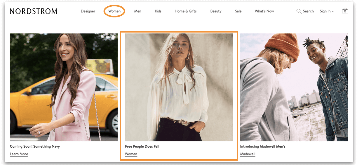
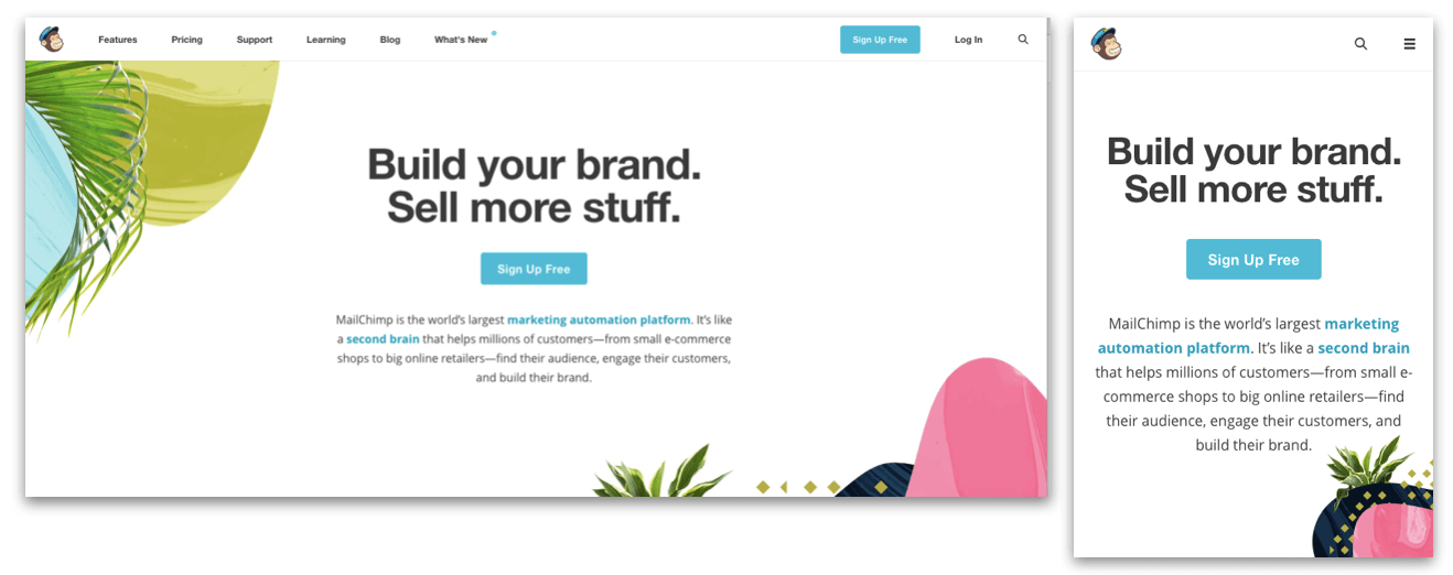
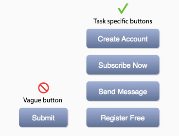 Image credit: uxmovement It’s also important to understand the environment under which the users are commonly interacting with your product. The navigation, layout and shortcuts are very different both visually and interactively if they’re using a smartphone vs a desktop computer. Take for example MailChimp’s web and mobile page shown below, as they follow the same structure and the content also remains the same; but the main menu on the mobile site is not longer displayed as a horizontal navigation but as a hamburger menu containing the same sections. The layout changed to a more simplified version of the desktop site and the shortcuts were only maintained for the sign up option and the search.
 WWF (2012) and Logitech

- Effectiveness
- Efficiency
- Engagement
- Error Tolerance
- Ease of Learning
Effectiveness
Effectiveness is about the high degree of accuracy under which users can complete their goals. The product has to be able to support the user while performing tasks. For example, validating each field of a form accordingly (the postal code field has to be 5 characters long and only contain numbers) and be informative while doing it so, this can reduce data entry errors and help the user finish the task correctly. It is also important to choose the right language to communicate and give instructions to the user. The clearer and simpler the language is you’re increasing the probability of understandability and also making the right impact on the user; this involves all the existent content in the product, even the error pages! Using the right level of technical jargon can make the difference; there are several studies that show how you communicate to the user can improve usability even by a 124% and therefore your effectiveness increases, too. When improving the navigation to increase effectiveness, the right balance of redundancy can sometimes be what you need, like having a shortcut to the best seller products on an e-commerce site or having breadcrumbs along with the navigation menu, and even placing the same content on different sections of the site can help effectiveness as the users are more likely to reach their objectives if they have multiple paths to perform the same task; plus it can also reduce the overall efficiency on those tasks, just be sure to find the balance and not bloat your site and annoy your users. Nordstrom, for example, has a category of “Women” clothing that you can find in the main navigation menu, but they also show it with a picture and a link underneath to browse in the same category.
Efficiency
Efficiency must not be mistaken for effectiveness as they are quite different and our goal is aim to have both of them. Effectiveness, as we covered above, is about the accuracy of the user to complete a task, while efficiency is how fast can the user finish the task. It’s all about speed! When you’re reviewing efficiency you have to look at the numbers of steps (clicks/keystrokes) needed to achieve the objective. If they can be reduced but of course, without compromising the effectiveness of the task it can help develop a more efficient processes; for example labeling buttons very clearly so the user can be sure of what to do next or creating shortcuts. Image credit: uxmovement It’s also important to understand the environment under which the users are commonly interacting with your product. The navigation, layout and shortcuts are very different both visually and interactively if they’re using a smartphone vs a desktop computer. Take for example MailChimp’s web and mobile page shown below, as they follow the same structure and the content also remains the same; but the main menu on the mobile site is not longer displayed as a horizontal navigation but as a hamburger menu containing the same sections. The layout changed to a more simplified version of the desktop site and the shortcuts were only maintained for the sign up option and the search.
Engagement
Engagement happens when the user finds your product enjoyable and satisfactory to use. Yes, aesthetics and great UI elements start to have relevance here, but they’re not the only factors implicated in creating a gratifying product that users like to interact with. We can say with certainty that engagement is not only about looking good; it’s also about looking right and letting users achieve their goals, among other marketing strategies. Having the proper layouts, readable typography and ease of navigation are also characteristics that will allow to deliver the best interaction making the product engaging. Here are two examples of engaging websites, that show not only great visual elements, but also play with interactive elements. They have easy to use navigation, and they communicate their message crystal-clear. WWF (2012) and Logitech
 Error Tolerance
Not one single interface ever created can be clean of errors as you can’t control the whole ecosystem under which the product is being used and certainly human error is only natural. However, what we can do when designing a product, is try to minimize errors from occurring but if an error does occur make sure the users can quickly and easily recover from it and get back to what they were doing.In Human Computer Interaction (HCI) this is known as error tolerance. Being tolerant to error means to make everything in our power to design a product in which is easy to achieve tasks and without letting the users get confused and do the wrong thing, for example:- Making all the navigation elements clear and visible so the users can know where they’re at and where to go next.
- The right language comes into play again: communicate everything with a simple language.
- The actions performed have to be consistent throughout the product to reduce the probability of mistakes.
- Limit the options to only correct choices.
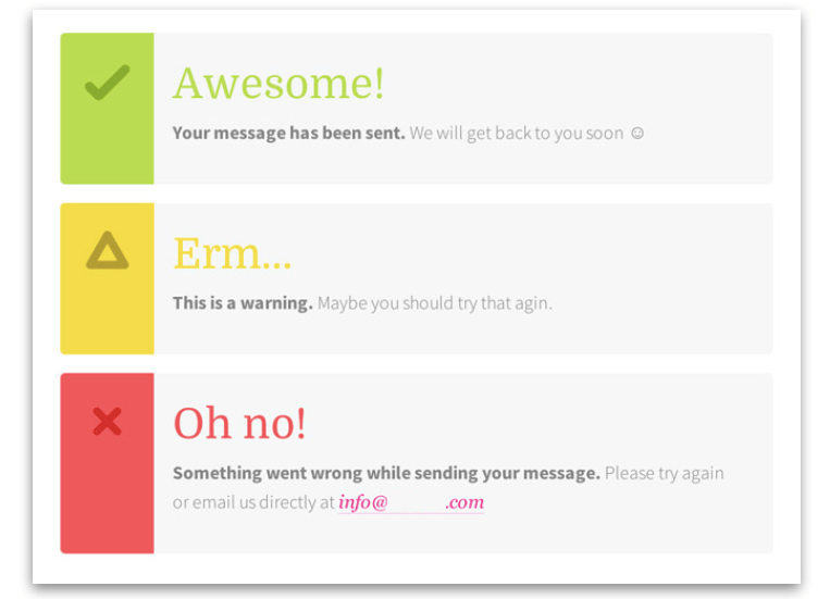
- And always provide feedback, like in the image below.

Ease of Learning
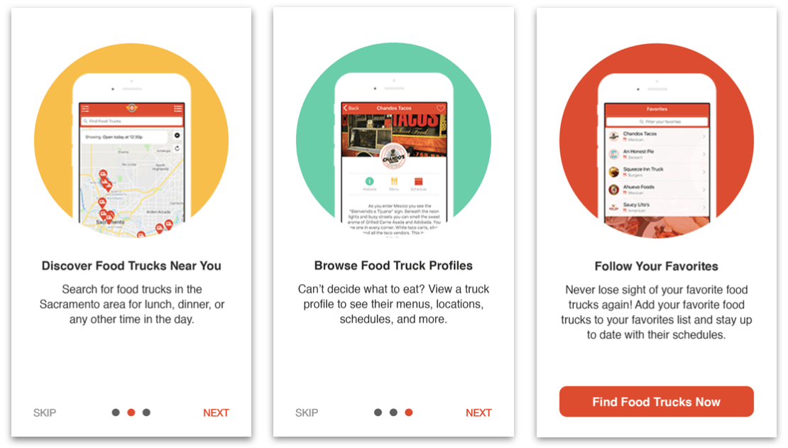
When a product requires the users to remember a lot of information or learn to do several things in order to be able to use it, it’s really hard for them to stick and engage with the product regularly. On the contrary if we have a product that lets the user learn to use it easily, the interaction will come as something natural the next time they use it. The ease of learning also applies when a product is releasing new features or renewing functionality, you want your returning users to be happy with the improvements you make instead of being frustrated because everything has changed and it doesn’t work as it used to. The solution for ease of learning is designing products matching the user’s mental models (representation of something existing in the real world; for example the trash can icon is the image of a real world trash can). Creating an “introduction” to the product that explains the features and tools it has, with the right language and the right visual aid can help improving the ease of learning. For example, the app to find food trucks around town, Diamond Plate shows in just a few screens the whole concept of the product and its features, letting the user create a mental model of the app before even using it. As a result, when it’s time to interact with it, the users can easily navigate and make the best use of the app by reaching their goals.