Government Websites Best Practices: User Experience Design
Summary: Top-performing websites combine simple and engaging custom visual design, easy navigation, plain language writing, smooth interactions, website-optimized branding, and high-quality graphics.

Summary of Findings
- Top 10 performing government websites in 2021 include state.gov, whitehouse.gov, sba.gov, boston.gov, coveredca.com, govt.nz, saveourwater.com, dmv.ca.gov, usaspending.gov, and canada.ca.
- Top performing websites combine best practices such as simple design, clear affordances, easy navigation, engaging visual design, plain language writing, smooth interactions, custom design, website-optimized branding, and high-quality graphics.
- Websites that earned poor ratings prioritized the content about their organization instead of user-centered information, featured automatically advancing photo carousels, missed breadcrumbs and the current page signals, tried to provide more than one content topic on most of the pages, featured generic and poor quality photography, illustrations, and icons.
- To improve your website user experience, regularly review website analytics, learn how people use the website, improve page loading speed, rewrite high-profile pages, develop an accessible design system.
Skip to the subtopic of interest:
What are the areas you should improve?
Improve the content quality and appeal
We see the most room for improvement in the areas of content quality and user interface design. Users expect content to be approachable, easy to understand, and clear. Compared to websites and mobile applications, some government websites are significantly less appealing and as such appear as not up-to-date.
- Attractive: 3.43
- Content quality: 3.53
- Clean and Simple: 3.70
- Easy navigation: 3.87
- Interaction: 4.14
Implement best practices: plain language and modern design
Plain language writing was implemented in only 9% of the reviewed websites. When websites are not written in plain language, a portion of the audience can’t accurately follow instructions or complete digital transactions. The visual design should be modern and follow the mainstream website aesthetics expectations.
- Plain language writing: 9%
- Modern design: 31%
- Custom Design: 32%
- Effective use of photography: 52%
- Distinctive branding: 53%
The chart above shows the percentage of 300+ government websites that follow standard user experience and visual communications design best practices.
Read more content like this.
We write about page speed performance, accessibility, usability, a variety of technology topics and more. Subscribe to our newsletter and connect with us on LinkedIn to receive future updates.
Examples of excellent government website user experience design
In February 2021, we evaluated over 300 California, U.S., and international government websites for user experience using a derived methodology that combines SUPR-Q (Standardized User Experience Percentile Rank Questionnaire) and evaluation frameworks used in web and interactive design competitions, such as IADAS’ Webby Awards.
We looked at the content quality, interaction, ease of navigation, attractiveness, cleanliness, and simplicity of the layout. We scored the five metrics on a scale from 1–5 for a maximum of 25 total points.
In our evaluation of over 300 government websites, we discovered that out of a maximum of 25 points across five criteria, about 47% of tested government websites score 20 points or above. This is good news!
We also assessed the level of visual design and if websites featured custom design outside of the standard template. We noticed details such as a modern design, distinctive branding, and authentic and engaging photography. We wanted to evaluate how, if at all, a more custom solution has an impact on the user experience scores, and if the two are correlated. (Turns out they are: websites that received high ratings from our experts also implement user experience best practices.)
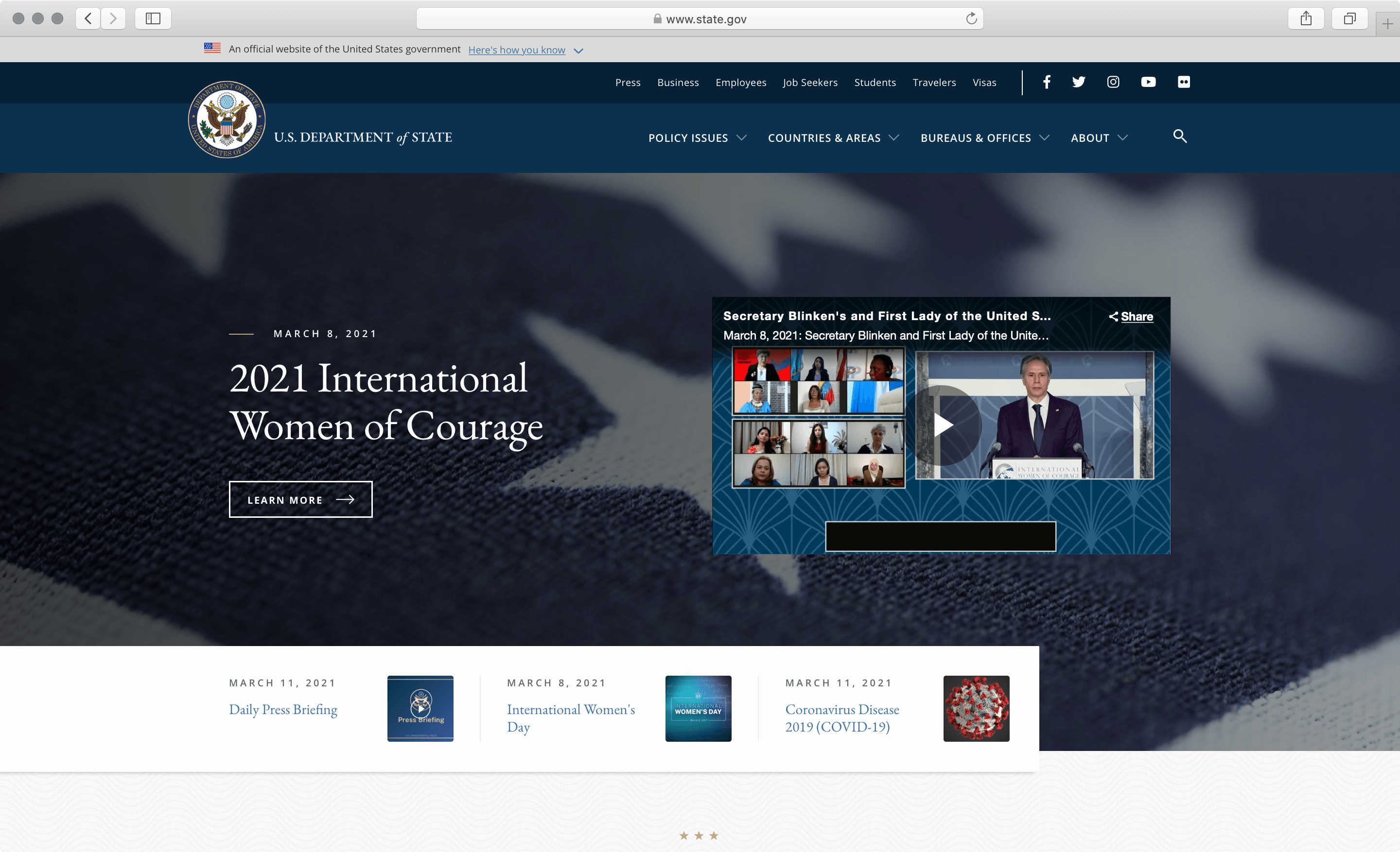
U.S. Department of State
A portal to many useful resources for international communities, including travelers, visa applicants, job seekers, students, and businesses, state.gov is aesthetically a well-designed website — combining typography, layout, and color from graphic design, with interactive elements and mobile-friendly design.
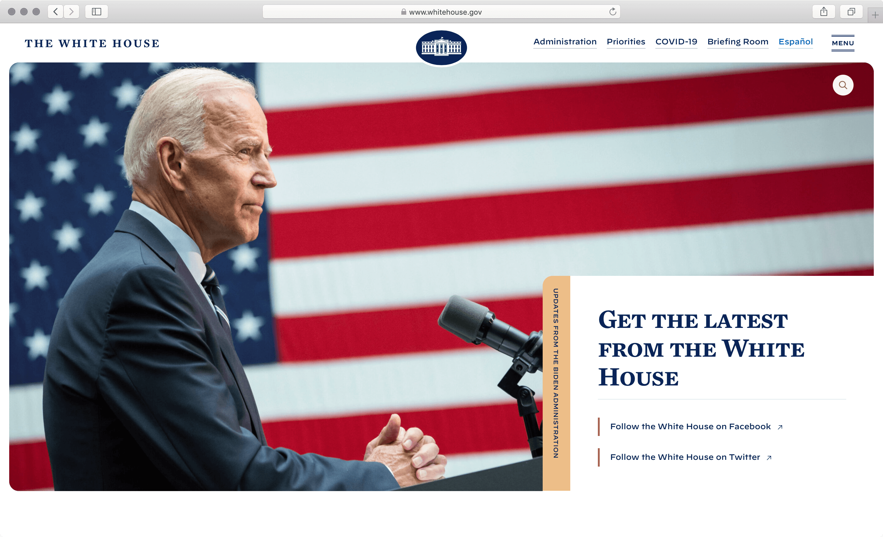
White House
The White House website is straightforward and easy on the eye. Information is broken down into bite-size pieces and laid out in a streamlined single-column layout. This makes it easy for visitors to read the information on a range of devices, from mobile phones to tablets and large desktop monitors.
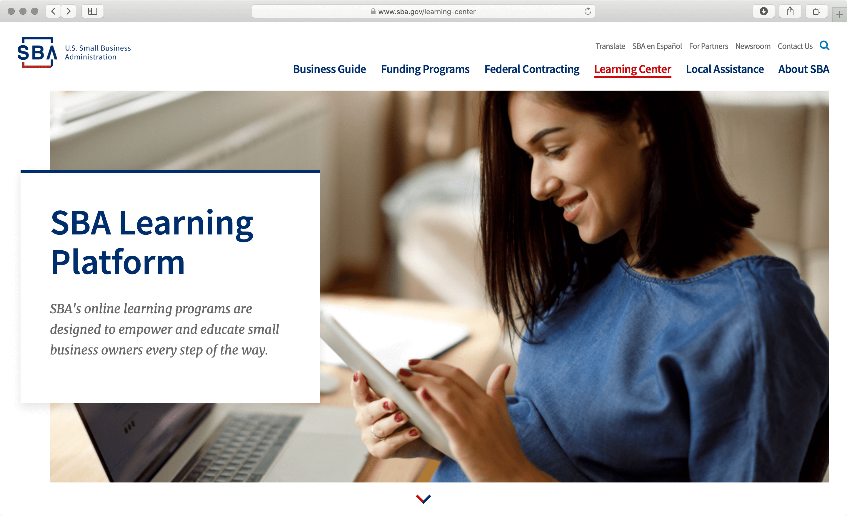
Small Business Administration
Apart from an attractive business guide for first-time business founders, the U.S. SBA website features a number of useful interactive tools that help new small business founders and more experienced owners alike to manage and grow their businesses.
Detailed analysis: Government Websites with the Best UX Design
UX best practices
The top-performing websites above combine best practices, such as:
- Simple design. The simple design usually comes off as attractive, unless oversimplified. But more importantly, using fewer attention-grabbing elements on the page reduces memory strain and choice overload, making the communication and messaging clear and easy to follow.
- Clear affordances. In the user interaction world, affordances are hints and cues on how an interface element can be used. Successful websites offer many affordances throughout the page, such as navigation cues, interface graphics, and linguistic and pattern affordances.
- Easy navigation. Easy navigation steers the user toward the correct information they are looking for. This includes providing breadcrumbs and intuitive dropdown options, as well as matching navigation and link labels to destination page titles. On the topic of easy navigation, as long as the user can follow a clear information scent, they don’t mind exploring multiple pages going beyond the never-proven three-clicks rule.
- Engaging visual design. In most of our top performers, visual design is accomplished by appropriate iconography and authentic photography. A good visual design directs the user to the task they need to accomplish and contributes positively to content findability.
- Plain language writing allows users to easily read, understand, and use the website. Good patterns include using pronouns to speak to the audience, active instead of passive voice, and simple verb forms.
- Smooth interactions between the users and the website with every interactive element, dropdown, button, and link. In successful websites, animations are used in moderation, and only to provide meaningful user interface feedback.
- Custom modern design, website-optimized branding, and high-quality graphics. Top performers pay attention to details such as optimizing the user experience on mobile or selecting authentic graphics. For example, the state.gov website drops the seal from the header on mobile devices and offers convenient mobile navigation. The usaspending.gov website features an animated illustration of budgetary details in the hero area, which is both attractive and useful.
What to avoid in the website UX
- Prioritized the content about their organization, and its mission, vision, and successes, instead of promoting user-oriented content and access to digital services.
- Featured automatically advancing photo carousels that we couldn’t pause, missed interactive states such as hover (mouseover), active, or current page links, and surprised us with an unexpected result of an interaction.
- Missed breadcrumbs and the current page signals, buried links to external websites in the on-site navigation, featured difficult-to-use dropdowns and mega menus, missed signals for external links.
- Tried to provide more than one content topic on most of the pages, had unnecessary highlights on every page of the website, and displayed insufficient typographic hierarchy and contrast, making it difficult to read long passages of text.
- Featured generic and poor quality photography, illustrations, and icons that don’t provide additional meaning. Many times icons are used in place of bullet points, which adds cognitive strain to the user as they try to understand the meaning of the icon. Another trend that we noticed on many California state websites is the use of the same photos of the Golden Gate Bridge and other iconic natural beauties. Despite such vibrant photos, users might be confused about which state website they just visited.
Read next: Five Simple UX Improvements — or — Why Government Website UX Matters?
We can help.
We have extensive experience in setting up organizations for user-centered design and improving their digital assets. For all questions, please reach out to our team of experts. Our favorite approach to solving user experience problems is Design Sprints, which we utilized in award-winning projects developed for SMUD Utility, California Community Colleges, and the California Energy Commission.