“Keeping the “technical hat” on for too long makes you forget how other folks (especially non-technical) people see things. The design sprint helped me to step back and look at building functionality from a business (non-technical) point of view.”
– Bhavik Patel, Director of Software Engineering
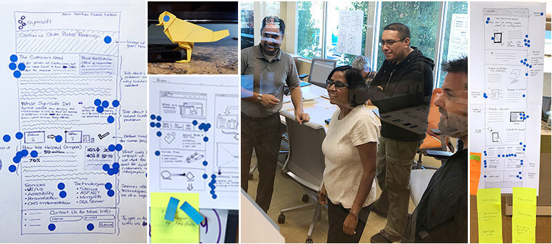
Earlier this month we did a five day design sprint with Marko Dugonjic, a visiting User Experience designer from Creative Nights. During the sprint, we focused on collaborative brainstorming and quick sketching exercises to help us discover ways to better communicate to our customers through the Symsoft website.
Here’s what we did during the sprint:
- Brainstormed the main priority for our website
- Sketched ideas
- Short, focused exercises (20 minutes max)
- Combined ideas from multiple roles (CEO, Technology lead, Project manager, design team)
Day 1: Identify the priorities
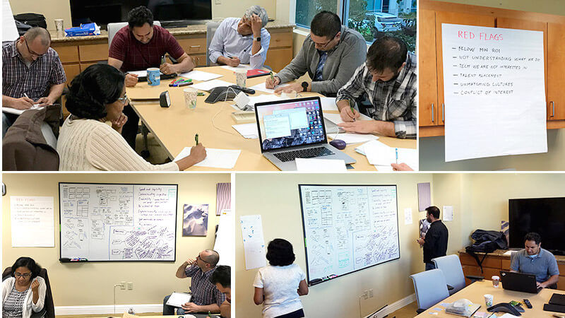
On the first day, we identified our priorities by brainstorming what matters most to our clients (such as understanding what we do), identified the “red flags” (what kinds of clients we don’t want to work with), and pointed out our strengths (talking with people in person, getting word of mouth references). From here, we were able to determine that our portfolio pages should be the highest priority for the week, with the main goal of generating more leads through our website.
Here’s what we did during the sprint:
- Identified areas of confusion on our current site
- Determined red flags
- Decided main priorities for the week
Day 2: Find inspiration and sketch
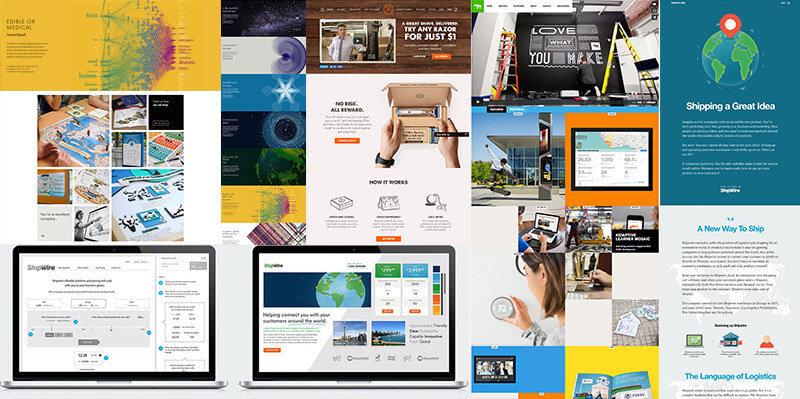
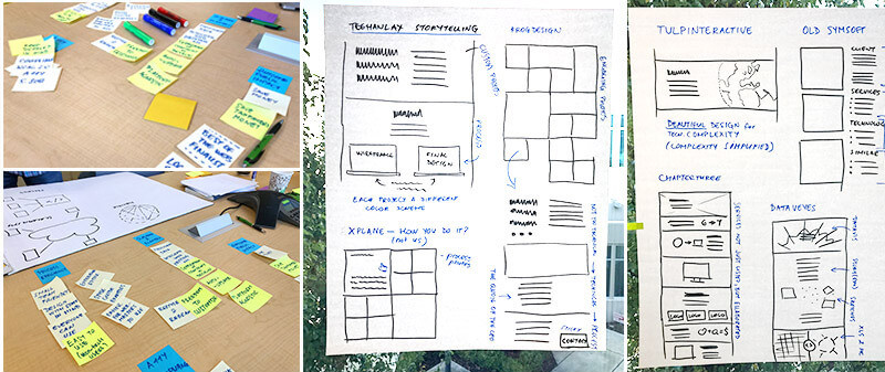
The next day, we did a quick review of the priorities. Then we looked through other existing websites for design inspiration, including sites that had particular features that could help us communicate those priorities. We each chose 3-4 websites that we liked, and talked through the strengths of each one. Next, we sketched out those strengths on a big sheet of paper for visual reference, and then further sketched out mockups based on those strengths. By the end of the day, we each had a full page sketch based on the priorities from Day 1, and the inspiration gathered from Day 2.
On the second day we:
- Looked through existing websites for inspiration
- Talked through websites we liked and explained why
- Sketched mockups based on our priorities and inspiration
Day 3: Critique the sketches
On the third day, we looked through the sketches with a fresh perspective and placed them all over the wall. We then walked around the room and marked a dot on each section that would help communicate our priorities. We talked through each sketch, and chose the strongest aspects to build into a final sketch to use as a guide for a more interactive design mockup.
On the third day we:
- Talked through sketches as a team
- Anonymously voted for sections that most align with our goals
- Created a final sketch based on our brainstorming
Day 4: Build quick web page & submit for user testing
The next day, the design team spent the morning sketching and building a quick web page for a project case study with the goal of communicating what we did for the project, and encouraging the user to contact us. We looked through the sketches and notes over the past few days, keeping our main priority in mind: focus on the portfolio page, and encourage users to reach out to us. By the end of the day, we had the portfolio page complete, and submitted it to Peek User Testing for some quick user feedback.
On the fourth day we:
- Sketched images for a one page portfolio piece
- Created a quick web page
- Submitted the web page for user testing
Day 5: Review user testing and talk through what we learned
“Watching the videos confirmed something – users don’t read. Just by looking into specific keyboards or images users should be able to identify themselves with the content of the website in order to keep them interested.”
– Daniel Calzada Herrera, Project Manager
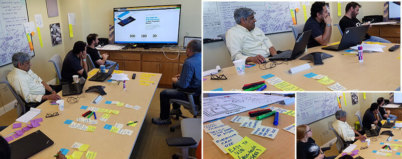
On Friday, we all reconvened in the conference room to watch videos of the user testing feedback of people reviewing our portfolio page. From the feedback, we learned that most of the user testers did not read all of the text, and that the main text at the top needed to be clearer. Some users were confused about what the portfolio page was about. We learned that we may tend to use very technical or industry-specific jargon which may turn some users away. Most users wanted to go to the ‘About’ or ‘Services’ page after immediately landing on the portfolio page. We realized that not everyone lands on the home page, so people need to be able to understand the context of the website from outside of the home page as well.
“Communication happens when you speak the other person’s language. “
– Savita Farooqui, CEO Symsoft Solutions
On the fifth day we:
- Watched videos of users testing the portfolio web page
- Viewed the content from an outside perspective
The main takeaways from the user testing videos were:
- Speak with common language
- Avoid technical, industry jargon
- Show, don’t tell
In closing
The collaborative, focused nature of the design sprint helped us to take a step back and look at the process of creating a website with a fresh perspective. By including business owners, technologists, and designers all as part of the creation and decision making process, we were able to leverage our collective strengths and ideas. The user testing confirmed that messaging matters. Overall, the process gave us new techniques for brainstorming together, and the ability to see our website through the eyes of our audience.