If you already read our comprehensive article on Government Website Best Practices: User Experience, you know that we reviewed and rated more than 300 government websites for page speed performance, accessibility, technology, and user experience (UX). Subscribe to our newsletter and be the first one to learn about our upcoming reports.
For each best-practice pattern that we identified, we provided an example website and elaborated on why it works. While many top websites share the same attributes, some are especially good examples that everyone in the public sector of digital services should look up to. These websites, which represent some of the best in government UX design, are examined in the article below.
If you want to jump to a specific website review, click the corresponding link:
- Simple design: The White House
- Clear interaction cues: California DMV
- Easy navigation: Gov.uk
- Engaging visual design: Save Our Water
- Plain language: U.S. Department of Veterans Affairs
- Interactivity: U.S. Small Business Administration
- Graphic design and branding: U.S. Department of State
When evaluating website user experience, we use a framework common in expert reviews, for instance design award competitions such as the Webby Awards. We looked at content quality, interaction, ease of navigation, attractiveness, cleanliness, and simplicity of the layout. We also assessed the quality of visual design and if websites featured custom design outside of the standard and generic templates.
We took note of details such as a modern design, distinctive branding, and authentic and engaging photography. We wanted to evaluate how, if at all, a more custom solution has an impact on the user experience scores and if the two are correlated. (It turns out they are, as our selected websites are all custom designed.)
While there are many other aspects and attributes of great user experience websites, we focused on these common patterns that you can hopefully take away and implement on your website. However, when considering implementing patterns like the ones we present here, always regularly research user needs, validate any updates with your target audience, and review the website analytics data. What works in one case might not work in another, so use the examples below as inspiration and a starting point in your own project, and customize it to your project’s objectives.
Without further ado, let’s dive into reviews!
1. Simple design: The White House
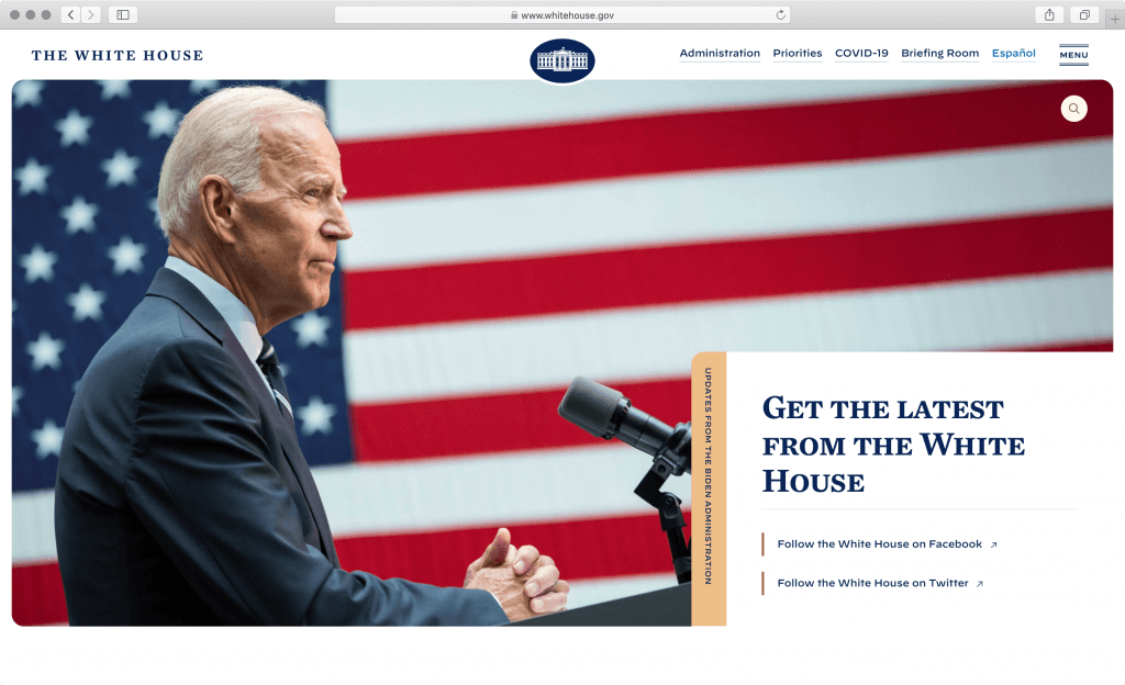
What is whitehouse.gov?
Whitehouse.gov is the official website of the White House owned and managed by the United States government. It provides a means for the general public to learn about the operations of the current administration. It contains information about the administration and executive offices, as well as press releases, the history of the White House, and overviews of the critical issues the administration aims to solve.
What stands out in the White House website?
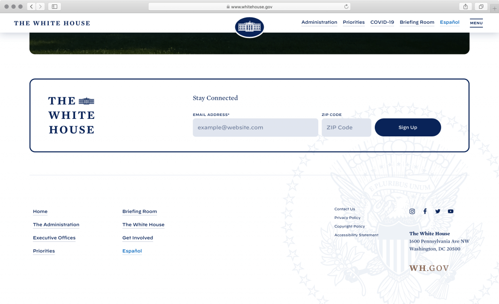
The White House website is straightforward and easy on the eye. Information is broken down into bite-size pieces and laid out in a streamlined single-column layout. This makes it easy for visitors to read the information on a range of devices, from mobile phones to tablets and large desktop monitors. Web forms are also laid out in a streamlined fashion and accessible on mobile devices too, like for instance the newsletter form at the bottom of each page.
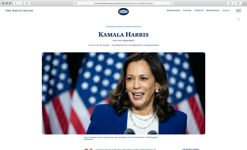
The website navigation (displayed both in the header and footer) is easy-to-follow with a focus on the administration that contains biographies and a list of key offices, personnel, and presidential priorities. (At the time of this writing, the top priority is COVID-19 mitigation.) The briefing room section includes topics such as Legislation, Presidential Actions, Press Briefings, Speeches and Remarks, and Statements and Releases. Such simple and straight-forward navigation helps visitors find all the information they need with just a few clicks.
We especially like the White House section that provides general information about the past presidents, their families, the grounds, and the educational subsection about how the government works.
Subtle choices like the photography selection and cropping, rounded instead of sharp corners, typographic detail such as the consistent use of uppercase for run-in headers, captions, metadata, and interface elements, as well as exceptionally balanced white space make this simple website quite interesting to explore and read. The color hues are very delicate (we like the light yellow as an alternative color to white), but in combination with the first-class typographic treatment they establish a very clear hierarchy of information.
What can we learn?
The whole minimalistic approach reflects the administration’s simplicity in communication. The lack of ornamentation spotlights the high-quality photography and copy-text and aids navigation and user orientation around the website. However, they avoid oversimplification by introducing typographic detail reminiscent of print optimized to work well on screens, and make things interesting with strategic photography art-direction.
Key takeaway
The simple design usually comes off as attractive. But more importantly, using fewer attention-grabbing elements on the page reduces memory strain and choice overload, making the communication and messaging clear and easy to follow.
2. Clear interaction cues: California DMV
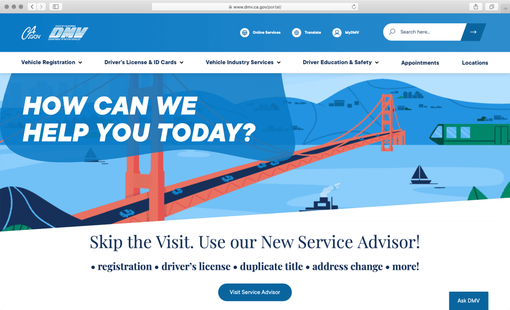
What is dmv.ca.gov?
Dmv.ca.gov is the official website of the California Department of Motor Vehicles, which regulates motor vehicle usage and sales. It offers online services for the public including licensing drivers, registering vehicles, issuing identification cards, etc. Besides, it provides online resources of driver education, safety guidelines, studies and reports, and DMV local offices.
What stands out in the California DMV website?
The California DMV website is well-rounded with a great blend of clear communication, illustrations, and interaction cues. It packs a number of calls to action on the homepage but in a very balanced way. The user is encouraged to complete transactions that DMV offers online.
What stands out is the cleanliness of the layout once the visitor enters the digital transaction process. Such an unobtrusive layout helps users focus on the task at hand and removes any unnecessary distractions. Any extra white space is balanced out with relevant illustrations that additionally provide visual anchors to hold your attention.
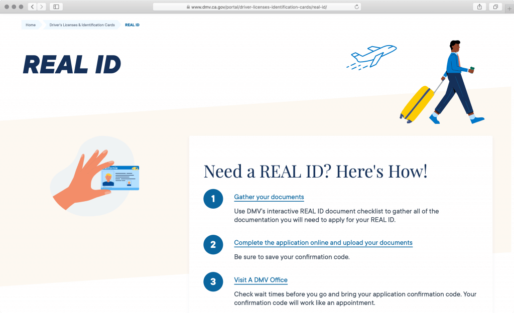
The basic idea of digital transactions is replacing physical office visits, saving time and reducing workload related to in-person transaction processing. For this to be successful, websites need to walk the user through the process and leave no stone unturned when it comes to exceptions and special conditions.
In such cases, the breakdown of steps is beneficial, and we saw this technique in many successful digital transaction websites, including Gov.uk, mentioned later in this article, and our projects for California Community Colleges and California Department of General Services.
We like the intelligent user experience design, instructional copy and lists on service pages, such as “Before you begin…” and “What to expect?,” that makes the user feel comfortable and prepares them before they begin the transaction. Trust is an incredibly important factor when asking people to complete a digital transaction, so any extra effort to put the users at ease and relieve some of that uncertainty is always appreciated.
What can we learn?
Interaction cues are not only about how the buttons and links look like or what the labels read. Often, great interaction cues include a conversational approach to communication, easy-to-follow instructions and checklists, and aligning the digital service with the users’ mental models (the ways people perceive the world).
Key takeaway
In the user-interaction world, affordances are hints and cues to the user on how to use an interface element. Well-designed websites offer many affordances, such as navigation cues, interface graphics, and linguistic and pattern affordances.
View the California DMV website
3. Easy navigation: Gov.uk
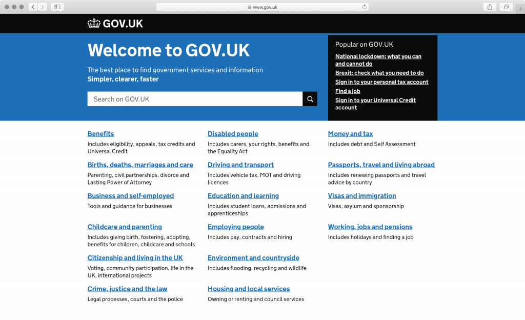
What is gov.uk?
Gov.uk is the central information website representing all government departments and many other agencies and public bodies of the United Kingdom. The public can find government services and information through the website, as well as news, communication, statistics, and consultations.
What stands out in the Gov.uk website?
Gov.uk is the industry standard when it comes to government digital services. It’s a favorite case study for digital government teams worldwide who improve digital transactions at the country, state, and local levels. And rightly so, the Gov.uk website saved £61.5 million ($85.9 million) in 2015.
Many things are great about this website, from the extremely fast loading speeds to well-organized services and content, to consistency in communication, but most importantly, to the way they prioritize user experience. To successfully onboard all constituents, they removed quite a lot of barriers, including the main website navigation, the mission statement, administrative updates, key facts, and other organization-focused content still seen on too many government websites.
But let’s talk about the brilliant service navigation. Technically the whole homepage is the main navigation. It organizes services and information into logical categories without forcing the user to think about the government organizational structure and which service belongs to which department or office. Constituents can get things done without having to learn the ins and outs of different government offices.
Each top category link takes you to the next level in the content organization, but to set the right expectations, the website also provides a clear list of subtopics with the minimal necessary verbiage under each link. Such concise descriptions give users the confidence to select the right category because they have a mini-preview of what to expect when they start drilling deeper.
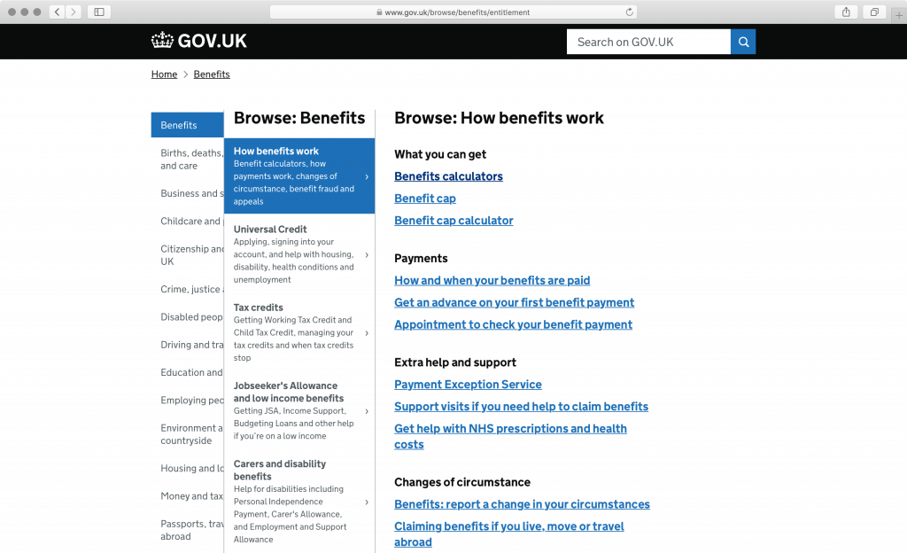
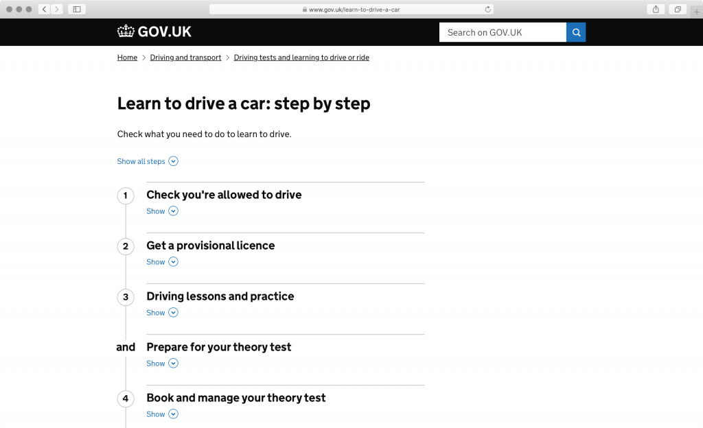
Another user-centered concept that the team behind the Gov.uk pioneered is breaking down tasks into bite-size steps. This technique helps users get a good sense of the process’s length and the effort required to complete the job. It works almost like a to-do list, helping you make progress and ultimately achieve clarity about the task at hand.
Many Gov.uk pages are free of any sidebar content. When there’s nothing to add to the page, the website doesn’t try to use up the available space. We do, however, think that a simple survey widget found at the bottom of many service pages is a smart move to help improve each page further. It asks a simple question, “Is this page useful?” and offers a couple of answers. If the answer is:
- “Yes,” they politely thank you for the feedback.
- “No,” they direct you to a 2-minute survey.
- “There is something wrong on this page,” they ask you for specific feedback.

What can we learn?
As a consumer, if you don’t like the customer experience with one brand, you have at least a few more alternatives to choose from and take your business there. However, with the government, people don’t have other options than to use government websites or visit government offices.
So, why not remove all possible barriers for them? Gov.uk demonstrates how a government website shouldn’t attract users with creative artwork and elaborate layout, but instead should provide quick access to information and services. Government website branding should be defined by convenience and effortless navigation, instead of graphic design elements and entertaining copy.
Key takeaway
Easy navigation steers the user toward the correct information they are looking for. This includes providing breadcrumbs and intuitive dropdown options, as well as matching navigation and link labels to destination page titles. On the topic of easy navigation, as long as the user can follow a clear information scent, they don’t mind exploring multiple pages.
4. Engaging visual design: Save Our Water
What is saveourwater.com?
Saveourwater.com is a website for a statewide water conservation program launched in 2009 by California Water Agencies and the California Department of Water Resources. The website serves as a communication tool to encourage Californians to adjust their water use by offering water conservation tips, guidelines, news, and resources regarding drought and climate impact.
Full disclosure, SymSoft delivered the Save Our Water website for the California Department of Water Resources.
What stands out in the Save Our Water website?
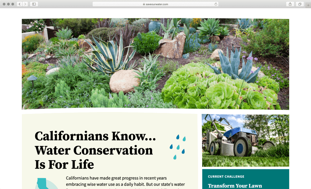
The Save Our Water website combines graphical shapes, colors, and typography that are less mechanical and rigid and more humanistic and organic. This selection of visual design elements supports the main message of the campaign about water use for outdoor irrigation.
What is the connection between the design decision and the content of the website? In California, about 50% of household water is used for outdoor irrigation, so transforming a lawn with drought-resistant native plants saves money, and is good for the environment. The difference between perfectly trimmed green grass lawns and yards incorporating native plants is in maintenance and water consumption. By selecting organic shapes and soft colors for the design instead of perfectly straight lines and fully saturated colors, the design is aligned with the message that low maintenance native plants lawns are better for the environment. The website uses its own design to subtly get the message across that you don’t need a perfectly rectangular lawn with razor-sharp edges to have a beautiful, gratifying yard.
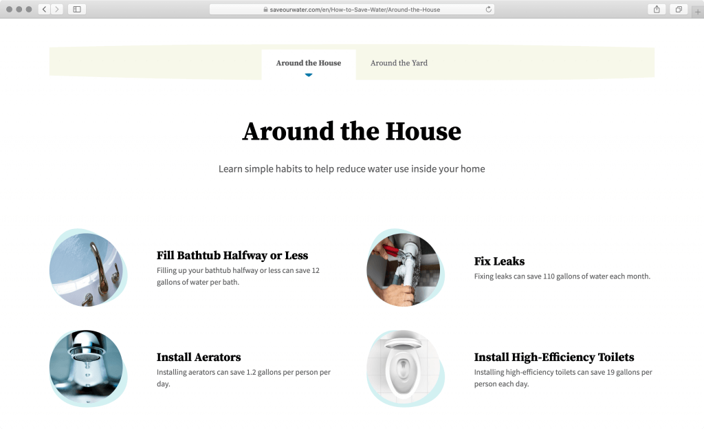
The website’s photography is saturated with colors, so the pastel shades of blue, yellow, brown, and green used on the website create a perfect backdrop, instead of drawing too much attention. Randomized organic shapes that resemble drops of water help photography stand out and double as bulleted-list symbols.
The same organic shape is combined with iconography, making even generic icons look fresh and new because they are a part of a comprehensive visual design system. A simple trick like this can help you achieve variance in a cost-effective way.
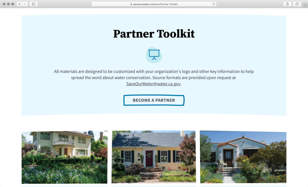
Even though there is only slight variance in organic shapes, when combined with clean typography, rich photography, and a vibrant color-palette, they create interesting combinations. The user doesn’t feel overwhelmed, because each new page and page element is built upon one another. In other words, even simple elements when combined together can create a virtually infinite number of visually interesting options.
What can we learn?
It is possible to stretch the norms of government aesthetics. When it comes to digital transactions like in the above examples of gov.uk and dmv.ca.gov, it’s all about usability, but to get people’s help and get them on board with an important initiative, campaign websites should entertain their visitors with a more elaborate design, storytelling, and fun ways to engage.
Key takeaway
In most of our top performers, visual design is accomplished through appropriate iconography, authentic photography, and overall contextual backdrop. An excellent graphic design directs the user to the task they need to complete and contributes positively to content findability. Great design will also engage with the visitors on the emotional level, especially to facilitate engagement and change of behavior.
View the Save Our Water website
5. Plain language: U.S. Department of Veterans Affairs
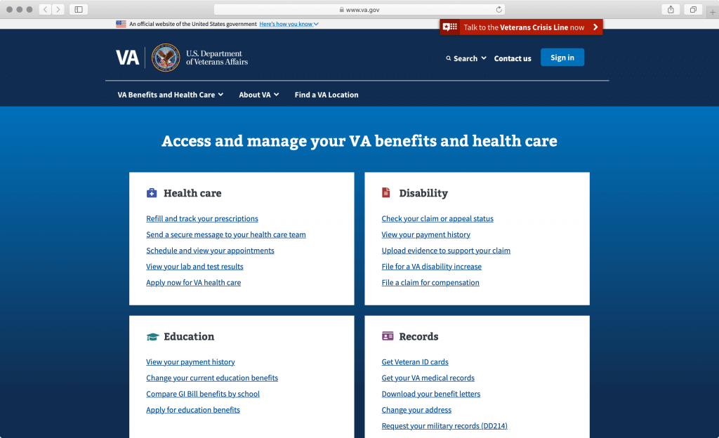
What is va.gov?
Va.gov is the website for the U.S. Department of Veterans Affairs that aims to provide support to veterans in healthcare, education, home loans, life insurance, and many other aspects of their lives. Users can access information through its official website about different benefits veterans receive, the history and innovation of the Veterans Affairs Department, as well as local Veteran Affairs locations.
What stands out in the U.S. Department of Veterans Affairs website?
Starting with a prominent list of actions visitors can take to manage their benefits and health care services, the website uses a simple yet active voice, making it very clear what the visitor can do and accomplish.
We especially like the avoidance of explicit user persona definition in the interface and navigation. Asking the visitor to self-identify can sometimes confuse them or make them feel uncomfortable by forcing them into a specific persona bucket, such as, for instance, homeless, women, or minority veterans.
While personas are useful to frame design thinking and help organizations to focus on the target audiences, we should always open up the website content, for example, by focusing on Job Stories, rather than User Stories. The difference between the two is that Job Stories focus on the context and desired outcome, regardless of the user group, while User Stories focus on the outcomes for a specific user group. The Veteran’s Affairs website focuses on the former removing the user self-identification step.
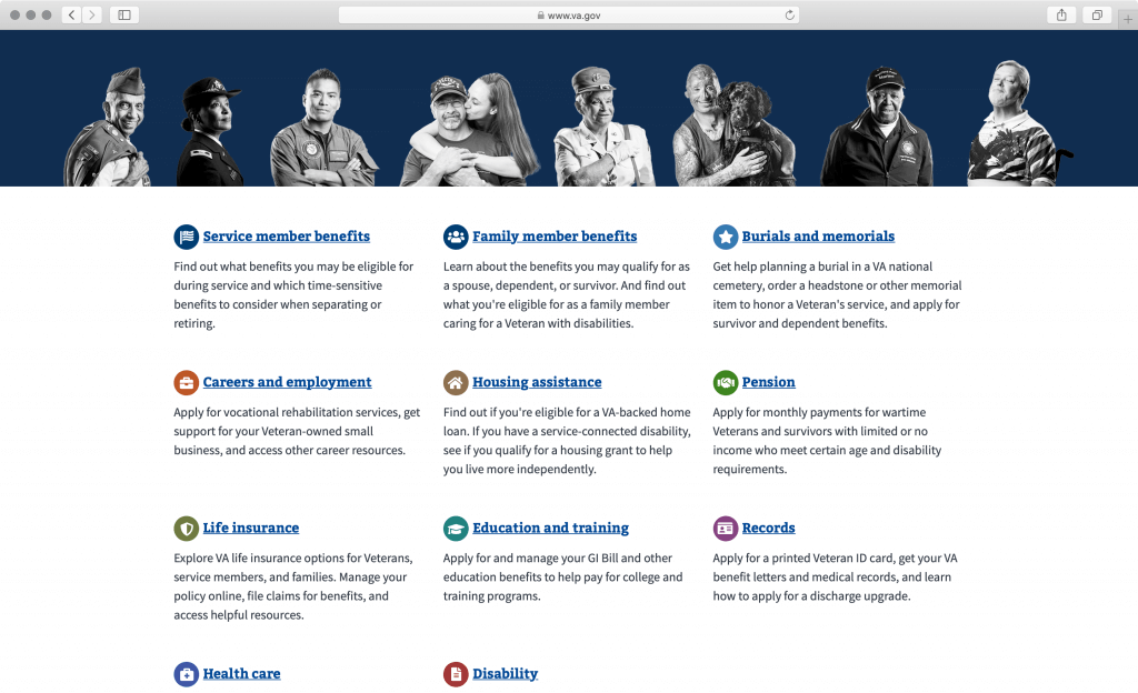
Even with a breakdown by topics lower on the homepage, the website is still focused on providing as much relevant context as possible, so that the user can decide whether they are following the right scent of information. Apart from embellishing each topic with an icon, topics are additionally color coded (each has a different designated color), a practice that can result in some repetition of colors especially when you run out of them. In Veterans Affairs’ case it works well, because the colored circles with icons are juxtaposed against the black and white photography above.
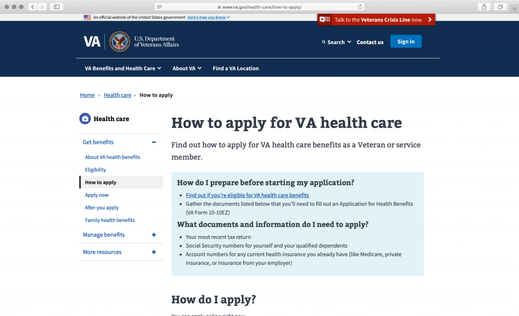
Drilling down further into content pages, it is obvious that every effort is made to keep the reader in control. Content is structured into bite-size pieces of information with sections such as eligibility, simple-to-follow how-tos and checklists. We like the useful headings, placing the main idea before exceptions and conditions, the use of lists, as well as the concise, approachable, and conversational style.
If you are familiar with the plainlanguage.gov guidelines, you will notice that the Veterans Affairs website follows many of the suggestions included there. Other useful plain language guidelines include the 18F Content Guide, Gov.uk Content Design, and MailChimp’s Content Style Guide.
What can we learn?
It is easy for government website content managers to write in plain language if they focus on users’ needs, levels of expertise, and interests. By prioritizing common actions and topics of interest, we can decide what information to provide, how to explain it, and where to place it for easy access.
Convenient ways to understand how visitors describe or conceptualize things include reviewing customer support forums and application reviews, as well as conducting a card sort. Card sort is an end-user activity that tasks participants (end-users) with organizing information cards into logical groups and naming those groups using labels that make the most sense to them. By observing how people talk about your content, you can improve the content and align it with their way of thinking.
Key takeaway
Plain language writing allows users to easily read, understand, and use the website. Other good patterns include using pronouns to speak to the audience, active instead of passive voice, and simple verb forms.
View the U.S. Department of Veterans Affairs website
6. Interactivity: U.S. Small Business Administration
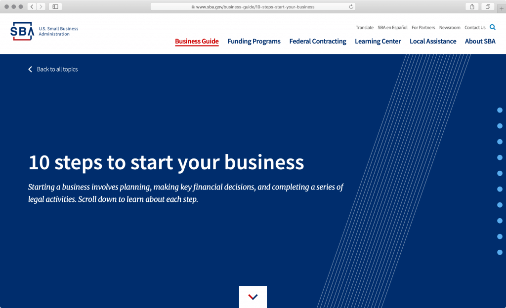
What is sba.gov?
Sba.gov is a website for the U.S. Small Business Administration, a government agency that helps small business owners and entrepreneurs by providing its expertise in counseling, capital, and contracting. Its official website contains information about business guidelines, funding programs, federal contracting, local assistance, and learning platforms.
What stands out in the U.S. Small Business Administration website?
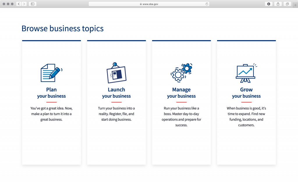
Apart from an attractive business guide for first-time business founders, the U.S. SBA website features a number of useful interactive tools that help new small business founders and more experienced owners alike to manage and grow their businesses.
But this is not all. Tools and guides are packaged in a minimalistic interface free of any unnecessary embellishment, with a very similar approach to the above-mentioned White House website. Such a simple design makes interacting with the website much more streamlined because ambiguity levels are very low, and it’s very clear which elements are a part of the interactive interface and which elements are content and information.
The navigation interaction is easy to use, and the interface always keeps you in the know about where you are in the website structure, including guide-specific navigation that enables sequential (step-by-step) as well as non-linear (free-form) exploration. The table of contents at the top of each page provides the visitor with a convenient overview of the different sections of each page, the feature we also spotted at the Gov.uk and Veteran Affairs websites.
The website features a number of convenient interaction patterns. In addition to providing multiple ways to navigate and explore, the website is optimized for keyboard use, with plenty of helpful interactions that make the keyboard navigation convenient and fast. The printable step-by-step infographics are a nice addition to the detailed instruction, and the sidebar examples expandable by the user utilize the power of storytelling to additionally explain specific steps in the guide.
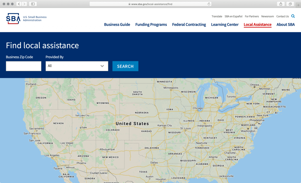
Among many useful tools, we liked the Assistance Locator, Break-even Calculator, and business plan templates that are clear and simple to follow. The Assistance Locator includes administrative offices, as well as loan centers that can help you invest into the location, equipment, or other assets.
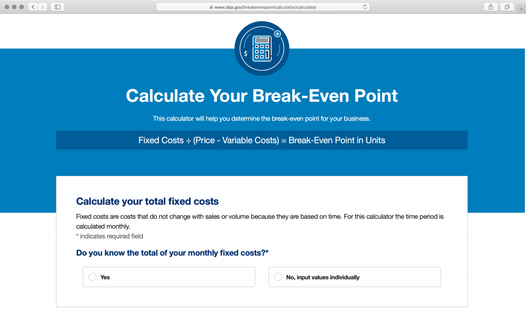
The Break-even Calculator helps you understand hidden costs, set revenue targets, and limit financial strain. Because the calculator asks critical questions that a startup owner might not be aware of, it can also be considered an educational tool.
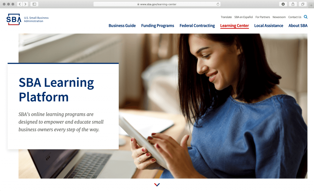
Lastly, the SBA website offers around 250 short video lessons—including transcriptions—on planning, launching, managing, marketing, and growing a business. Coupled with guides, tools, stories, examples, and templates, these video lessons make SBA.gov an extremely well-rounded interactive website.
What can we learn?
Breaking down complex tasks into smaller steps and providing useful tools can help users (in this case small business founders) navigate the complexities of starting, owning, and growing a business. By providing different structured ways to interact with the website and learn information, the website visitors get a comprehensive understanding of the topic. Because of the logical organization of the content, the website can be used as a reference for startup founders and help them easily pick up where they left off during their exploration and learning process.
Key takeaway
Interactivity and interactions between the users and the website are encouraged with every interactive element, dropdown, button, and link. In successful websites, animations are used in moderation, and only to provide meaningful user interface feedback. But more than interface effects, great interactivity is accomplished when the user can interact with the system by changing their input and query to retrieve customized and personalized information.
View the U.S. Small Business Administration website
7. Graphic design and branding: U.S. Department of State
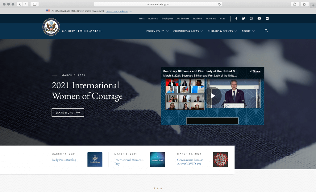
What is state.gov?
State.gov is a website for the United States Department of State. The Department leads America’s foreign policy and international relations. It’s mainly responsible for fighting terrorism, protecting U.S. interests abroad, and implementing foreign policy initiatives, as well as many other policy issues.
What stands out in the U.S. Department of State website?
Apart from being a portal to many useful resources for international communities, including travelers, visa applicants, job seekers, students, and businesses, state.gov is aesthetically a well-designed website. It marries the best of both design mediums — typography, layout, and color from graphic design, and interactive elements and responsive design from Web design. It is aesthetically the most sophisticated of all websites featured in this article.
Careful typography choices, color scheme, iconography, and texture all work well together, but we especially like the high-quality graphics, photography, and illustrations used across the website, whether as persistent visual elements or as content images. Classic typographic elements like divider lines, white space, and layout breaks are combined with interactive components, like navigation, links, buttons, and tabs, to great visual effect.
The whole website is inviting to explore and read. We like how the interchange of different page sections feels natural, even though they use only a few distinctive elements. As with the above-mentioned Save Our Water, the website combines multiple simple elements in creative combinations, adding visual variance that is very pleasing and comfortable to look at.
Branding is reinforced with colors and typography too. There is great attention to detail. For instance, the Department of State’s seal is hidden to save screen real-estate on mobile screens. This is yet another example of how branding goes beyond the logotype, something that graphic designers know all too well. One of the best-kept secrets in graphic design circles is that, to establish a visual brand, you only need a font, color, and space.
Another secret is keeping the logomark simple in shape and texture. Elaborate logotypes are especially troublesome on mobile screens because of the impact on legibility when reduced to such a small size. Some logotype designers mitigate this problem by providing a simplified, small-size version of the logomark that can replace the full version on small screens or low resolutions, but if the visual language for the brand is established with type and color, like in the state.gov case, the reduced logo version can be skipped.
What can we learn?
Attention to detail is important and it can be achieved and maintained at a high level of quality. But attention to detail is most noticeable if it’s applied consistently. This is where strong visual design fundamentals are important. By creating a design system that accounts for multiple different content types and layouts, the website’s aesthetic details feel like parts of a whole and leave that pleasant impression of fit-and-finish.
Key takeaway
Good quality websites pay attention to details such as optimizing the user experience on mobile or selecting appropriate and authentic graphics. For example, the state.gov website drops the seal from the header on mobile devices and offers convenient mobile navigation. Another website, usaspending.gov, features an animated illustration of budgetary details in the hero area, which is both attractive and useful.
View the U.S. Department of State website
What are other examples of a great government website user experience?
In conclusion, there are many great government websites out there, and we hope that the above review has given you a good idea about best practices, as well as how to review and assess government or any other websites. We encourage you to visit a few other notable examples and identify the patterns we highlighted in this article:
- California Public Utilities Commission
- Smoke Spotter Mobile Application
- San Joaquin County Economic Development
- City of Boston
- Covered California
- New Zealand Government
- USA Spending
- Information and Services for South Australians
- Visit California
- California Conservation Corps
Many of the featured websites share common patterns, but they also share the same level of detail, or what we like to refer to as fit-and-finish. When all different aspects, from Information architecture, and navigation design, to page layouts, typography, color, and photography come together, the website feels engaging and easy to use. The same is true of our award-winning websites for California Energy Commission, California Community Colleges, and Sacramento Municipal Utility District.
What you should do next?
- Follow us on LinkedIn or subscribe to our newsletter for more insights like this.
- Read the Government Website Best Practices: User Experience and Performance articles.
- Contact us for a free consultation. Let’s discuss your next project!